A search bar that everybody needed
OVERVIEW
JOB TYPE
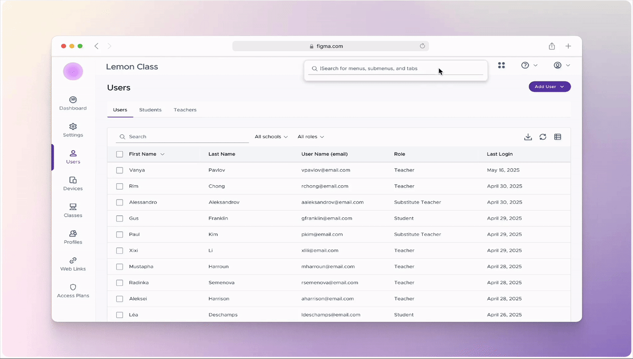
This is a data-heavy admin platform where users manage schools, teachers, devices, policies, and web activity. Power users lived here all day. And yet there was no search. No command line. No global find. No shortcut out of complexity.
THE PROBLEM
Admins weren’t struggling because the product lacked features. They were struggling because everything was buried. Navigation assumed users knew: where something lived what it was officially called and which product area owned it That’s not how humans think, especially under pressure. Without search, every task became:
Click → scan → back → click → scan → repeat
WHAT I DID
- Observed users clicking around our product, looking for a destination.
- Read the struggles that arrived to our support channel.
- Made an indepth comparitive analysis of other products' search bars.
- Ensured it was passing WCAG 2.1.
- Presented to the design team, development team, and leadership of the issue and mockups.
IMPACT
- It was adopted into the official design system and component library.
- It is now roadmapped to be included in all products in the company.
- Less clickaround for users when searching for a page.
- Opened the door for more microinteractions in user experience.
Full-time
TEAM
Designer: 🙋🏻♀️
VP: Jarrett Volzer
FE Development: Pravin Erande
Project manager: Parul Bhat
INTERACTION STATES
ON FOCUS
- Anchored to the top-right alongside other high-level actions
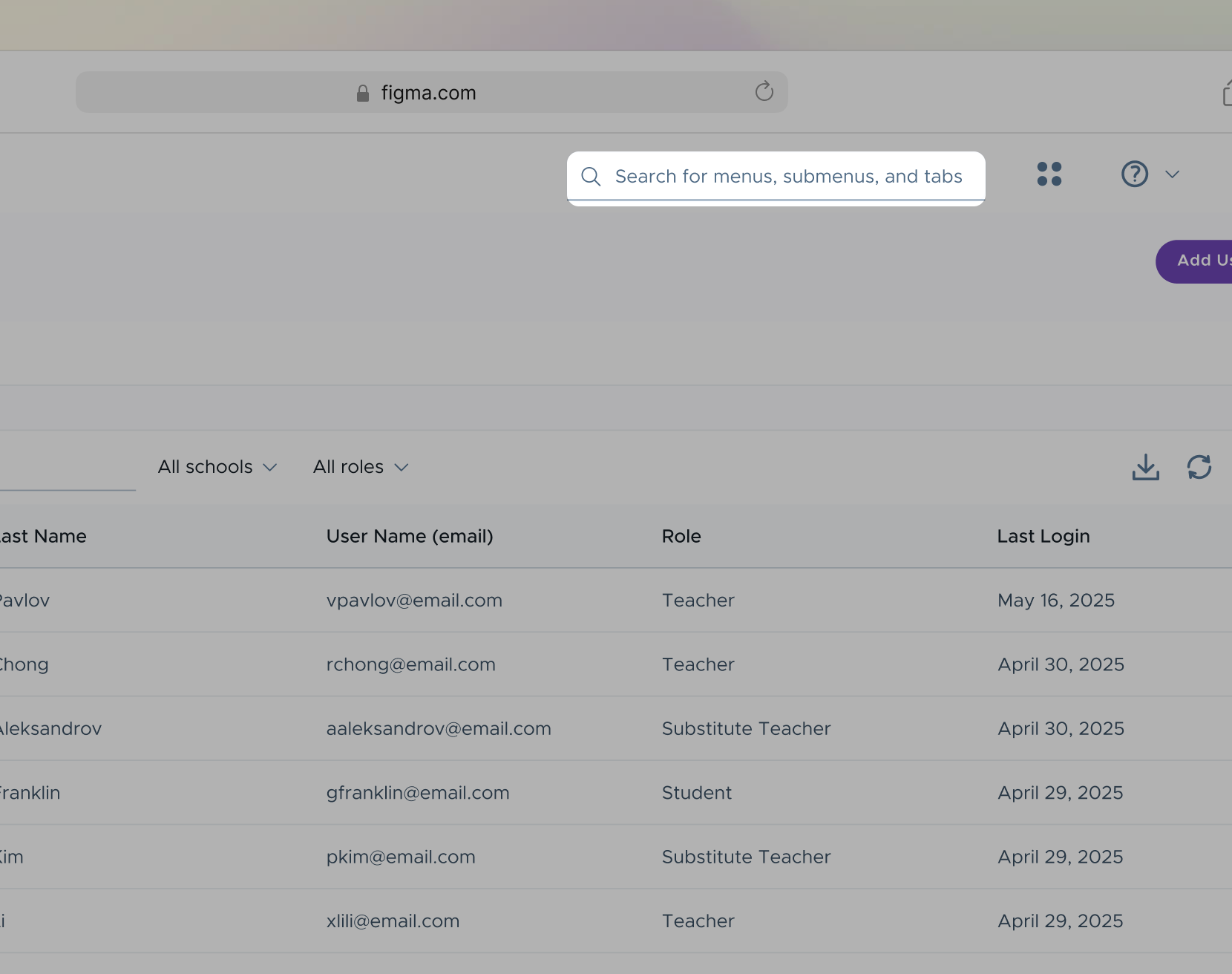
Positioned with global controls to reinforce that search is a system-wide capability, not page-specific. This aligns with users’ mental models and reduces discovery friction for power users who expect global tools in consistent locations. - 75% increase in width, expanding to the left to preserve layout stability
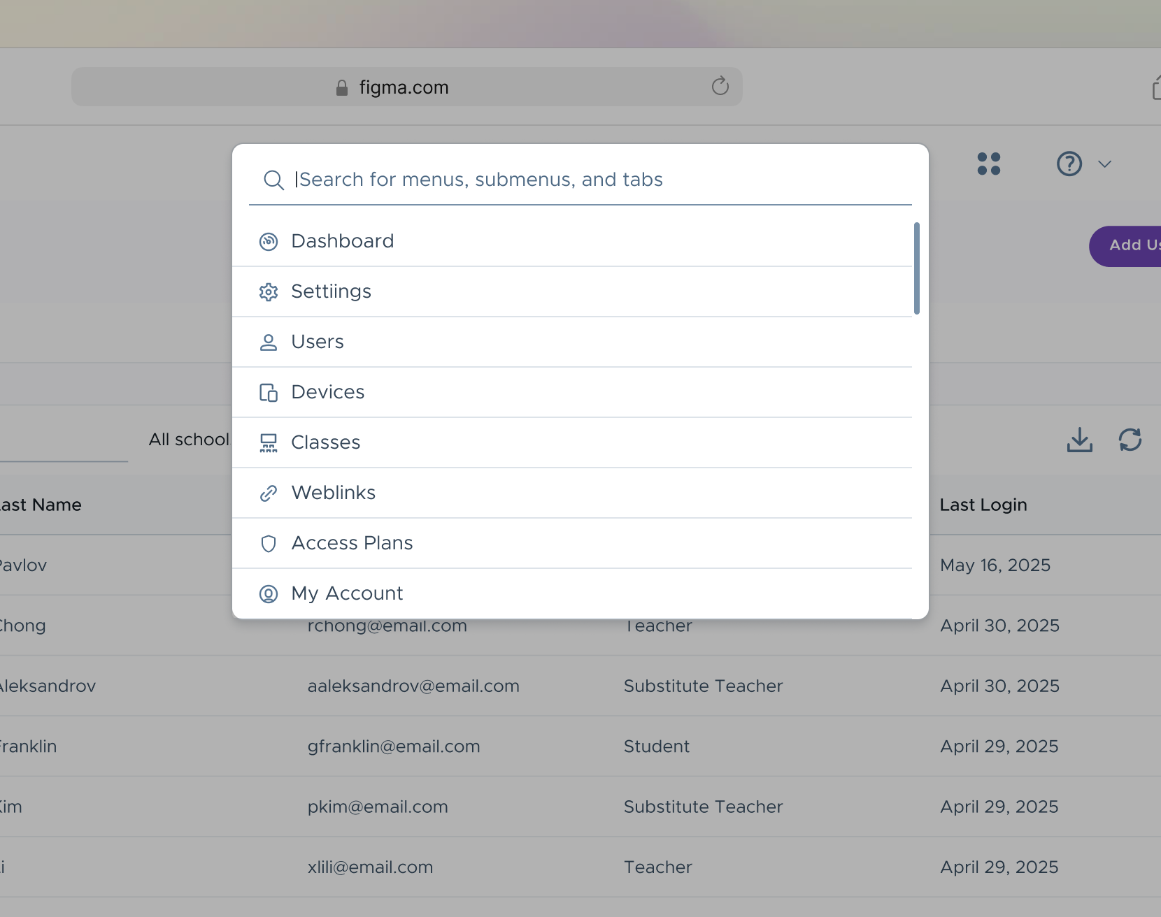
The field expands leftward to avoid pushing or reflowing adjacent primary actions. This creates visual prominence for the active task while maintaining spatial consistency and preventing accidental - Dropdown of suggestions for immediate recognition over recall
Surfaces high-frequency destinations and recently used areas to reduce cognitive load and time to result. The suggestion list allows users to navigate with minimal typing, supporting both exploratory behavior and fast, goal-oriented workflows.
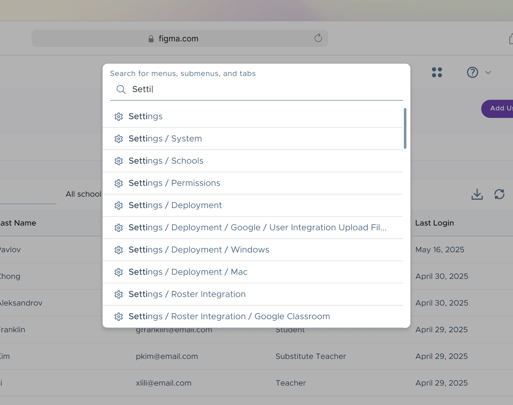
WHILE TYPING
- Results update in real time as the user types
Establishes immediate system feedback and responsiveness as the primary interaction principle. - Exact text matches are visually emphasized
Supports rapid scanning and confirms relevance as results refresh. - Full navigation path is displayed for each result
Adds necessary context in complex hierarchies, helping users choose the correct destination confidently. - Helper text transitions to a persistent label
Maintains context and accessibility as the user types, preventing loss of instructional guidance. - Label preserves space when idle
Remains within the search bar when not in use.
MICRO-INTERACTION
FROM IDLE TO INTENT
A single interaction transforms an empty field into a guided entry point, using motion and hierarchy to shift the user from browsing to action. Delays, easing curves, and transition timing were carefully adjusted to make the state changes feel responsive and seamless.
TAKEAWAYS
This project reinforced that complex products don’t need more features, rather they need better access to the ones they already have. By introducing a global, system-aware search, I've reduced friction in everyday admin workflows and gave power users a faster, more human way to navigate complexity.
Designing this search bar required balancing:
speed vs. clarity
visibility vs. visual noise
flexibility vs. consistency across products
Every interaction state was intentionally designed to provide feedback, preserve context, and minimize cognitive load. Beyond solving an immediate navigation problem, this work helped establish a shared pattern for microinteractions across the product ecosystem and raised the bar for interaction quality in data-heavy tools. :)