
Student Management Re-design
GOAL
PROJECT TYPE
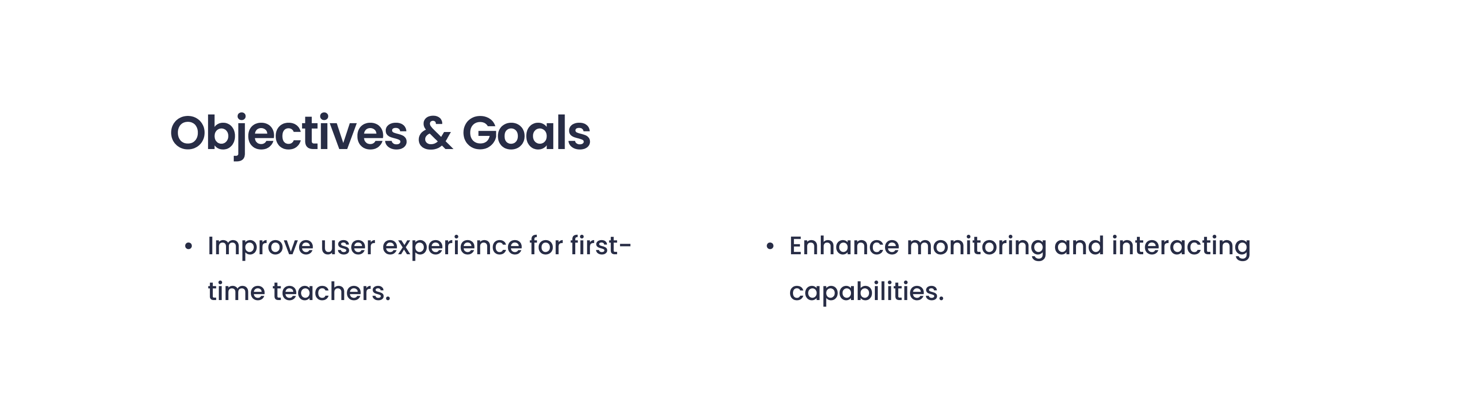
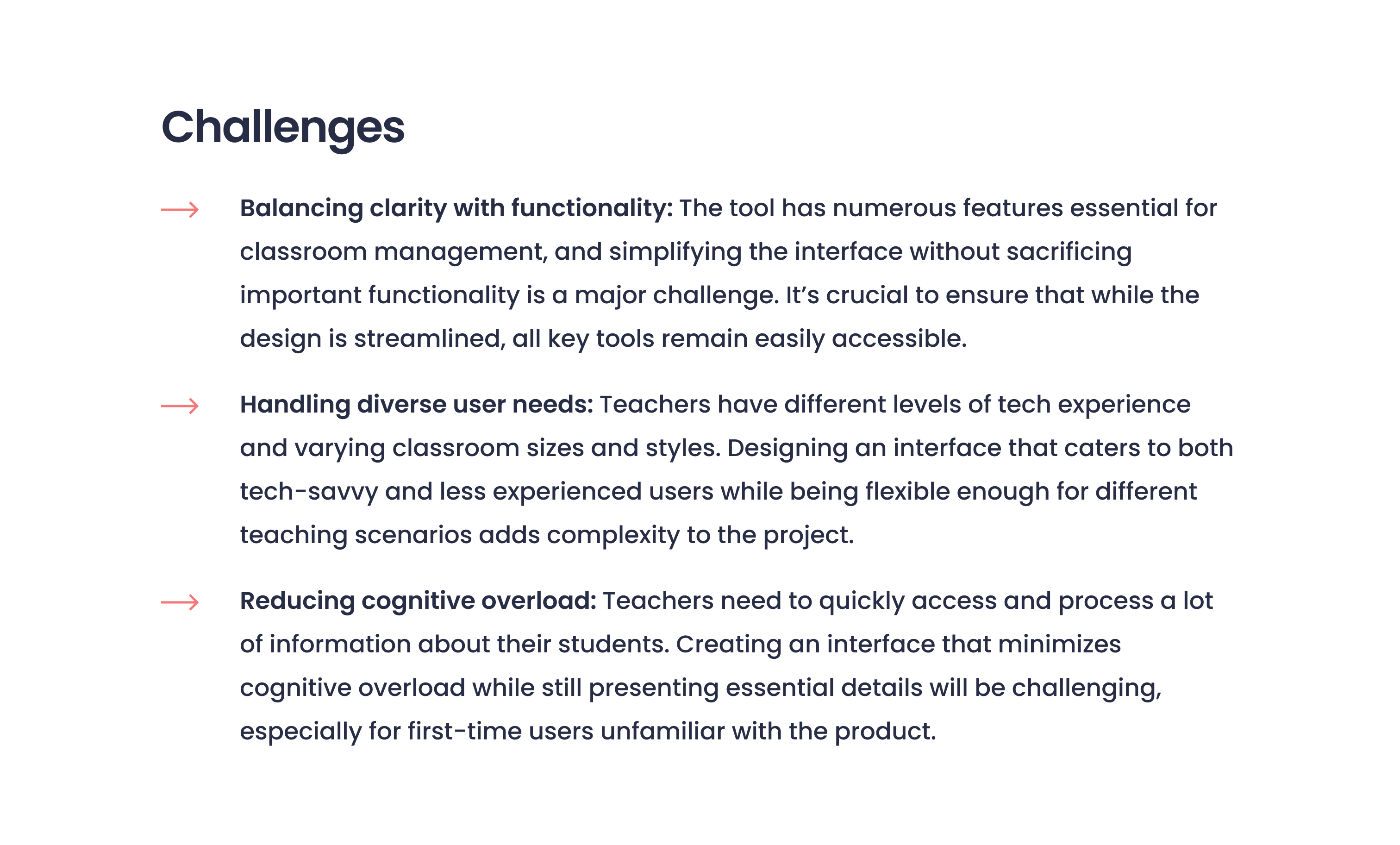
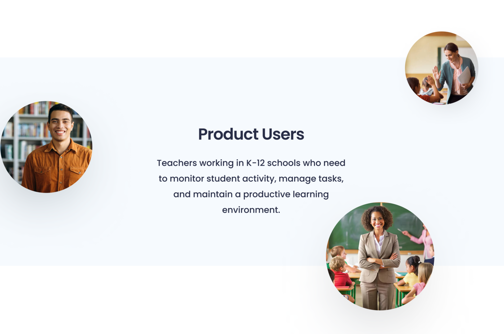
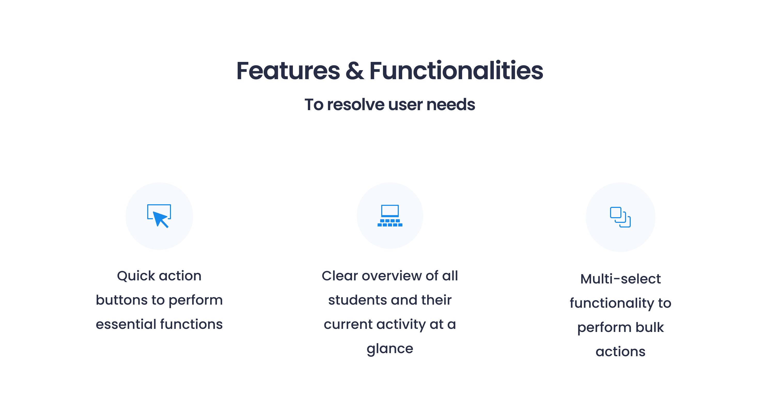
The goal of this redesign was to modernize a section from one of the company's main products. The design was outdated and difficult to navigate for first-time users. Its complex nature served as a challenge as it encompasses various classroom management capabilities and functionalities for monitoring student activity. My overarching objective was to seamlessly integrate these features and ensure the intuitive utilization of tools necessary for efficient classroom management. This design exercise was my application to the company and has led me to my acceptance. I am now in charge of designing for this product line along with 2 other products.
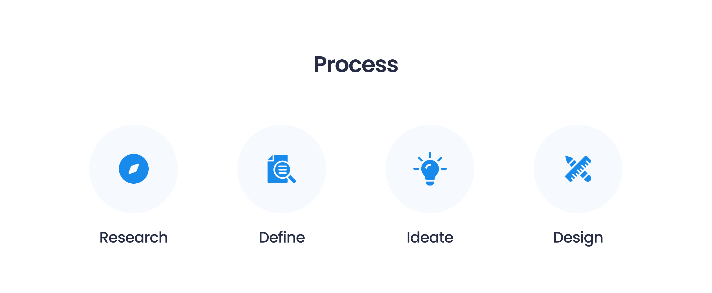
Design Exercise
TOOLS
Figma

SCREENS
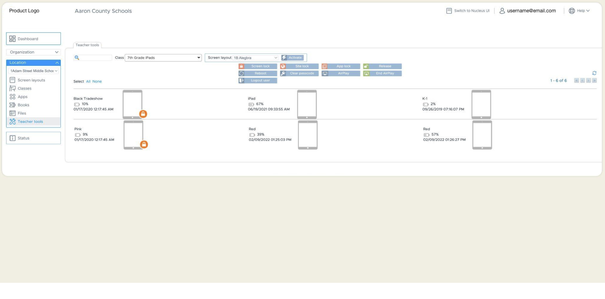
Original

Re-design

Ideation
Initial Thoughts
To the right is a list where I imagined myself as a teacher using this product.
I like to put myself in the user's shoes and quickly jot down my first impressions. I find these lists effective in spotting functionalities that may not be intuitive for first-time users and identifying user pain points.

Break into Tiers
Considering the overall target audience, objectives, and design goals, I categorized each section into tiers to prioritize the content types and visualize an effective design solution.


Lo-fi Wireframes (1)
I freehanded several drafts of the screen containing students and devices to explore different design possibilities. After each idea, I listed my afterthoughts and implemented them into the next draft to continuously refine, compare, and improve the design.

Lo-fi Wireframes (2)

Lo-fi Wireframes (3)
I decided to go with a layout that provides an overview at a glance with the option to click into a student's device to see detailed information. As a teacher, my goal would be to easily monitor all my students while having the ability to focus on one student when needed.

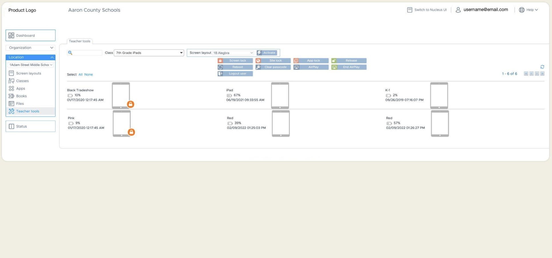
Tool buttons
Tried to rethink button logic by combining certain actions and simplifying tool usage. At first glance, I was overwhelmed by the many possible options. There were some actions that could easily be merged into a single button, reducing interface complexity and cognitive overload. Examples:
- ‘Lock’ works for both app and site, depending on what the student is currently viewing.
- ‘Lock’ and ‘Release’ could exist as one button.
- ‘Airplay’ and ‘End Airplay’ could exist as one button.

Checklist
While drafting the mockups, I create a worded checklist of tasks to complete. Every detail is crucial for a clear and successful UI handoff. This checklist is constantly updated and modified throughout the process.

Re-designing: Class List
Original
Wireframe

Final Re-design
Filtering
As teachers typically teach only a few classes throughout the year, I found that the search bar wasn’t necessary. Instead, I created filtering options that change the viewing order of the classes based on the teacher’s preference.
The filter options would be as follows:
- Scheduled Order
- Alphabetical Order
- Recently Edited
ORIGINAL


Other Tools
Originally, these class editing tools were always present on the screen. Since these actions aren't used frequently, I created an options dropdown menu and moved them there. The option to ‘Edit’ the class information has also been added to this list.
ORIGINAL


Hamburger menu
- To simplify the main screen for monitoring, the left navigation bar has been made into a hamburger menu.
- The original header containing the account options, the option to switch to Nucleus UI, and Help have also been placed here.
- Teacher Tools and student details have been combined into a new tab titled ‘Classroom Dashboard’.
- A ‘Settings’ tab has also been created. The school location information would be accessible and editable here.
ORIGINAL


Re-designing: Teacher Tools
Original
Wireframe

Final Re-design
Header
Applied hierarchical typography and simplified the header for a more simpler, modern feel.
ORIGINAL


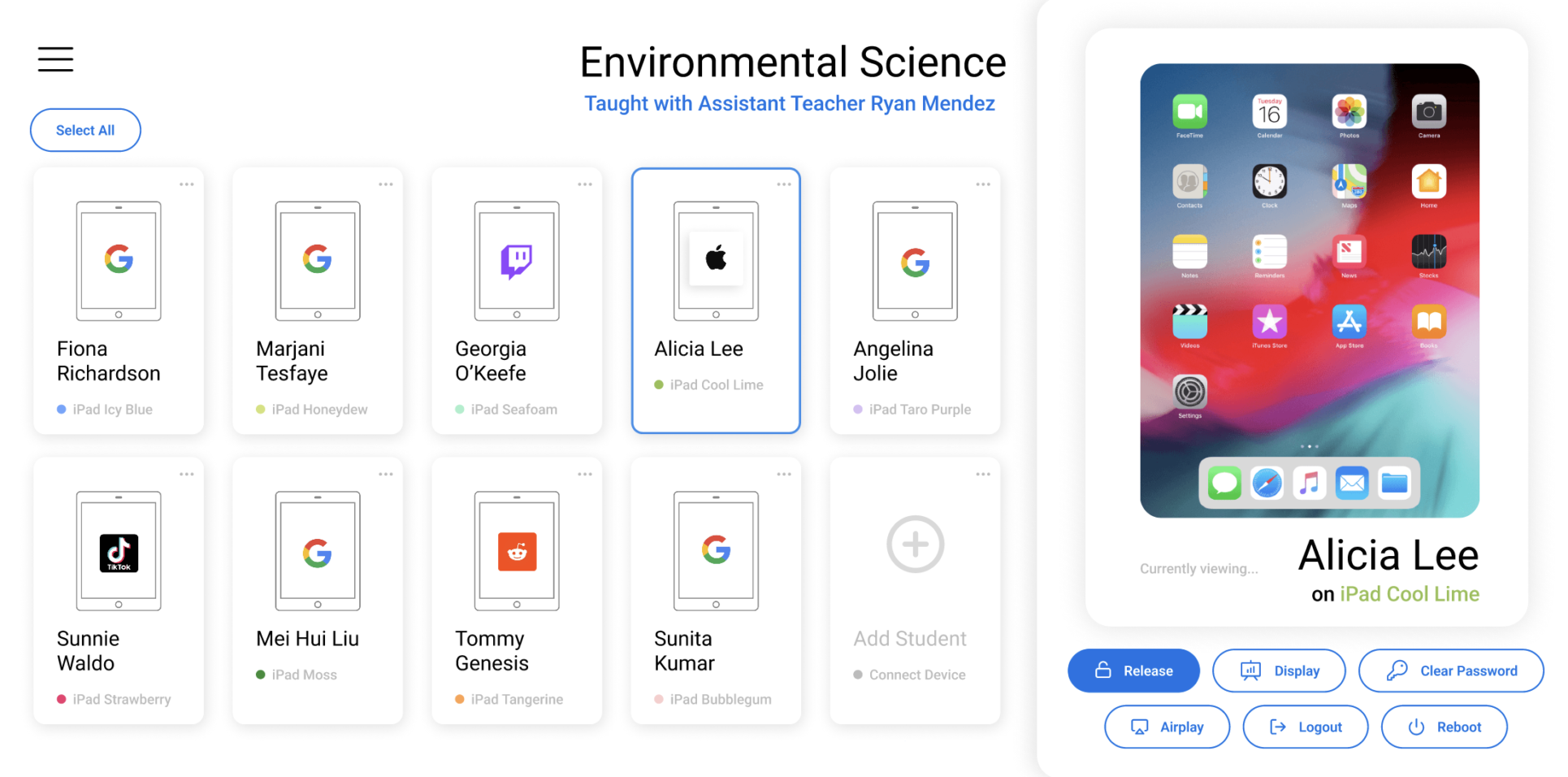
Card visual
The card shows only three crucial information:
- Student
- Device
- Icon of current app / site
Other information has been relocated.
ORIGINAL


Glance Monitoring
To allow the teacher to monitor all students from a glance, the icon of the active app/site is shown on every student’s card (real-time).
ORIGINAL


Options
- The option to Remove from Class has relocated to the new Options dropdown menu.
- Additionally, the option to Edit, Duplicate and View More Information has also been added.
- Tier 3 information such as the student/device’s serial number, last sync date, and other information is accessible via the More Information menu item.
ORIGINAL


Add Student
As it is not often that teacher have to add students/devices, the option to add/delete a student has been removed from the tool bar. It is now shown as a single card at the end of the card collection with lower visual presence.
ORIGINAL


Individual Monitoring
- The teacher is able to view a student’s screen of their choice in real-time.
- This window is shown to the right of the program’s screen accompanied by relevant teacher tools. It shows the student’s screen, the student’s name, as well as the device’s name.
- Typographical hierarchy and sizing have been considered here for a comfortable monitoring experience and obtaining just the necessary information.

Individual Monitoring Tools
Only the tools that are relevant to the current device’s status will be shown here.
For example, if the app or site is already locked, the option to ‘Lock’ will not be shown. The option to ‘Release’ will be shown instead. This allows the tool experience to be more intuitive and direct.
ORIGINAL


Multi-Select
Single-clicking onto several cards or drag-selecting will allow for a multi-selecting function.

Multi-Select Viewport
As each additional card is selected, the cards will visually stack up in the right-side viewport– giving a clear indication to the teacher that multiple cards have been selected.
A simple overview of the selected devices and apps is also shown at the bottom.

Multi-Select Options
- As multiple statuses of each device may exist in the group of selected student cards, all options for Teacher Tools will be shown.
- The tools are shown in an organized way, with each action type in its own row.
- These tools will serve as master actions to override the status of all devices in the selected group.

Flow Change
- The system ideally would allow teachers to input the schedules of each class into settings.
- Therefore, depending on the date and time, the relevant classroom dashboard will be automatically shown as the opening page (without the class selecting precursor).
- If the teacher wants to open a different class despite the current date and time, this option is available via the hamburger menu item ‘Classes’.
