FinTech Startup Rebranding
COMPANY OVERVIEW
ROLE
Paymonths was building Korea’s first Buy Now, Pay Later platform. Without relying on traditional credit scores. They used machine-learning–based alternative credit scoring, opening access to users and businesses typically excluded from conventional systems.
The problem?
Their brand and product experience didn’t communicate that difference. The visual identity felt generic for a product that was quietly radical. I was brought in to define how trust, inclusivity, and intelligence should feel—and translate that into a cohesive brand and digital experience.
Sole Product Designer
Branding Intern
TOOLS
Figma and Wix
DURATION
10.2020 – 12.2020
REBRANDING OBJECTIVES
Traditional financial products lean rigid, heavy, and intimidating. Paymonths needed the opposite—confidence with warmth. My rebrand focused on:
Goals
- Discover and highlight the differences of Paymonth's service compared to other financial services.
- Embody the embracing tone of voice in the vision of Paymonths and integrate it into its visual branding.
- Visually differentiating Paymonths from traditional financial services
- Reinforcing an embracing tone of voice across brand and UI
- Supporting users with varying financial literacy levels
Goals
- Discover and highlight the differences of Paymonth's service compared to other financial services.
- Embody the embracing tone of voice in the vision of Paymonths and integrate it into its visual branding.

MY ROLES
- Brand strategy & visual identity
- Logo redesign & symbol system
- Color, typography, and illustration language
- Website UX/UI (desktop + mobile)
- Early-stage B2B product UI
Goals
- Discover and highlight the differences of Paymonth's service compared to other financial services.
- Embody the embracing tone of voice in the vision of Paymonths and integrate it into its visual branding.
Logo Re-design
Original logo
→
New Logo
REFRAMING TRUST
The original logo lacked visual weight and cohesion. I redesigned the logo to feel grounded, stable, and intentional, while keeping it approachable.
Goals
- Discover and highlight the differences of Paymonth's service compared to other financial services.
- Embody the embracing tone of voice in the vision of Paymonths and integrate it into its visual branding.
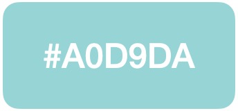
- The primary color shifted to a deeper seafoam, increasing perceived reliability without defaulting to black
- Harsh black was replaced with an almost-black seafoam to soften contrast while maintaining legibility
- The result balanced seriousness with approachability.
Goals
- Discover and highlight the differences of Paymonth's service compared to other financial services.
- Embody the embracing tone of voice in the vision of Paymonths and integrate it into its visual branding.
Paymonths Main Color
Their logo and their main color were changed to a deeper tone of their seafoam. The goal was to weighten the sense of trust and dependability.
New Logo Colors
The black color in the original color was replaced with an even darker sea foam that is close to black. This reduced harshness while maintaining a solid contrast between the two colors.
MOON SYMBOL
The meaning: The moon represents payment cycles. The term linguistically connects to the Korean word for month, “dal” (달).
Shape change: Enlarged and anchored the moon to the vertical stem to improve visual stability and elevated the symbol from decorative to structural so it could scale confidently across products.
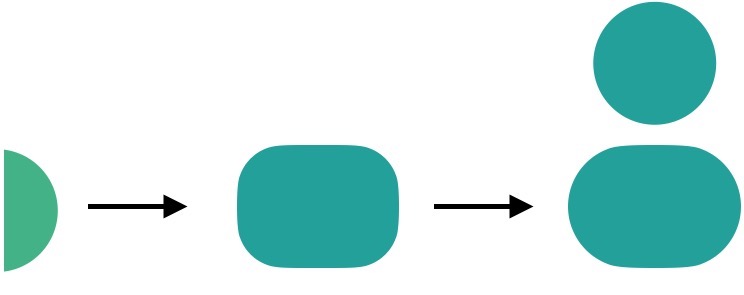


Matched the moon’s curve to the counter of the “P” for continuity.
Logo Types
NEW LOGO
ICON VERSION
ALTERNATIVE VERSION
COLORS
The palette was intentionally restrained. The colors were used to support comprehension in complex financial contexts.
Primary

Secondary

Tertiary
Text
- Primary: Deep seafoam (trust, continuity).
- Secondary & tertiary reminder colors: Used sparingly to guide attention and hierarchy.
- Text color: Tuned for long-form readability, not just contrast compliance.
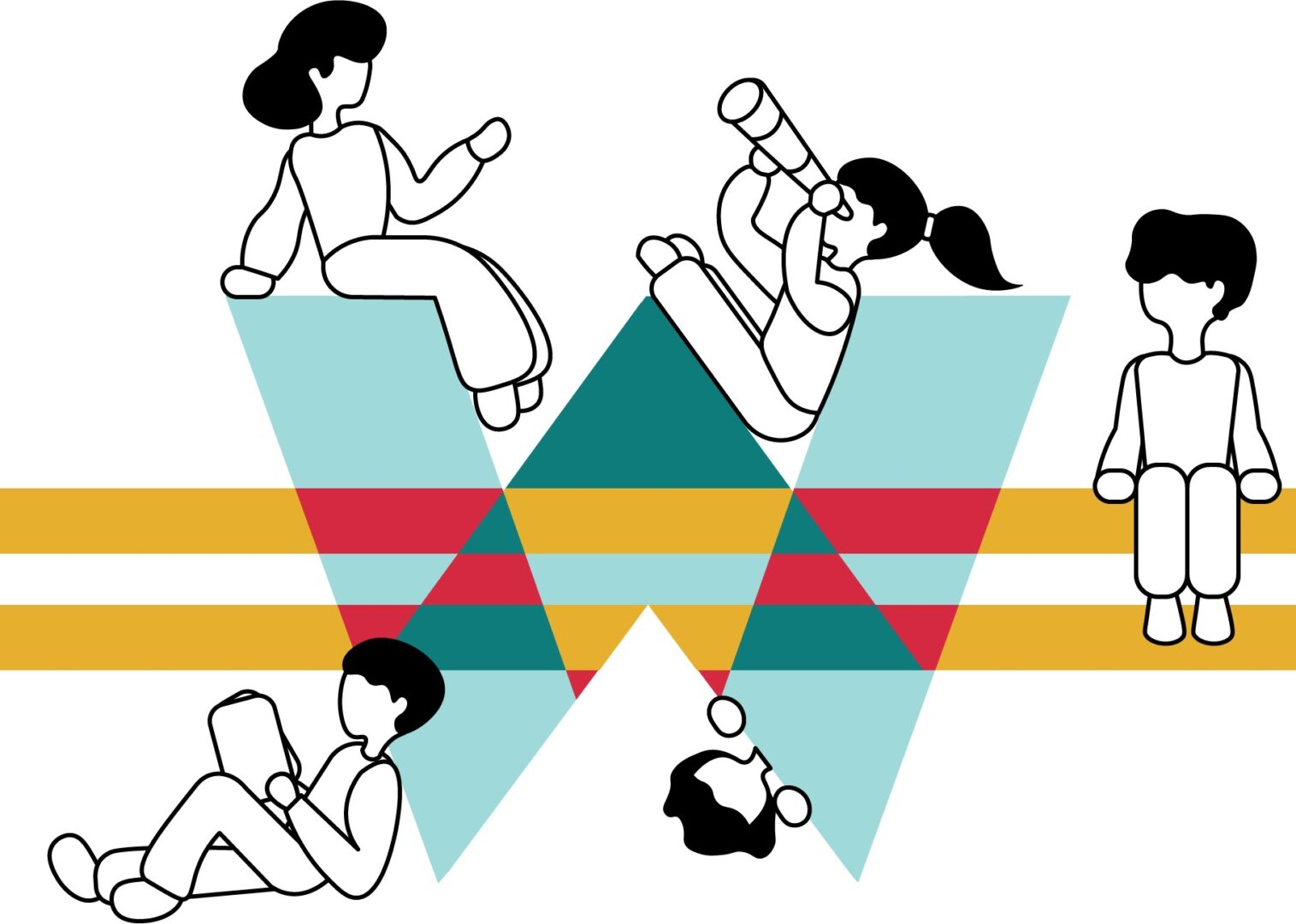
ILLUSTRATIONS

TYPOGRAPHY
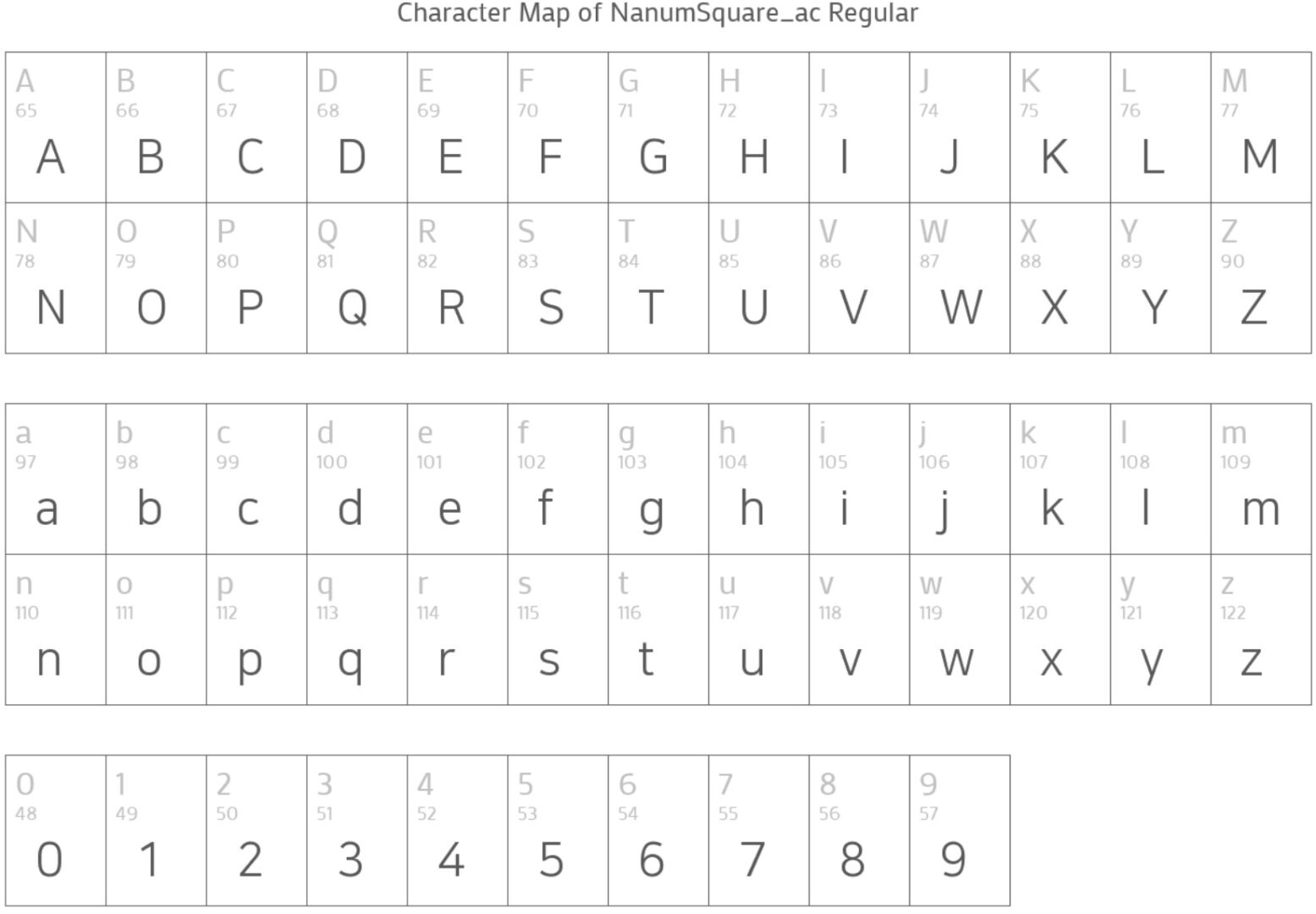

KOREAN TEXT
A typeface that softens the angles while highlighting rigidity in the lines, the Nanum Square font was a great fit for the all-embracing FinTech brand.
ENGLISH TEXT
Poppins Semibold: Used selectively for headers and emphasis.
Its rounded forms offset the rigidity of Korean text. It also created rhythm and visual contrast without overpowering content
Typography played a major role in making financial information feel less intimidating.


Main Website Re-design
ORIGINAL
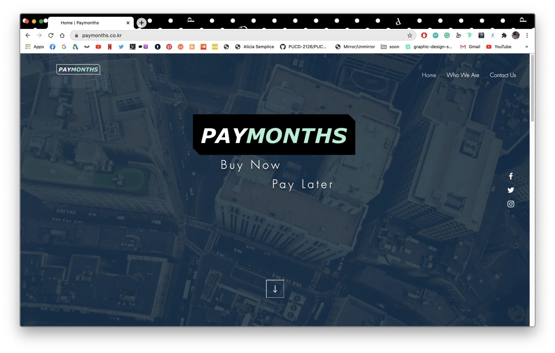

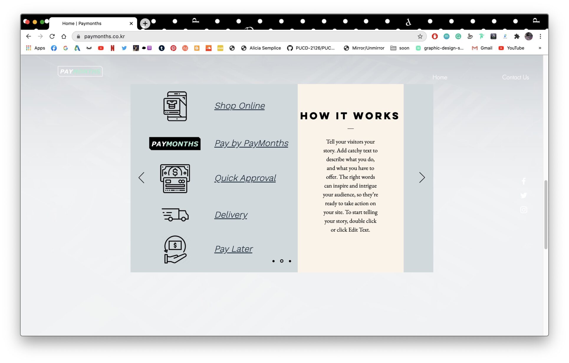

RE-DESIGN

I redesigned the site using continuous vertical scroll, allowing users to absorb the product story progressively.
- Clear sectioning for vision, mission, and service explanation
- Motion and timed interactions subtly guide attention
- Illustrations reinforce concepts without over-explaining
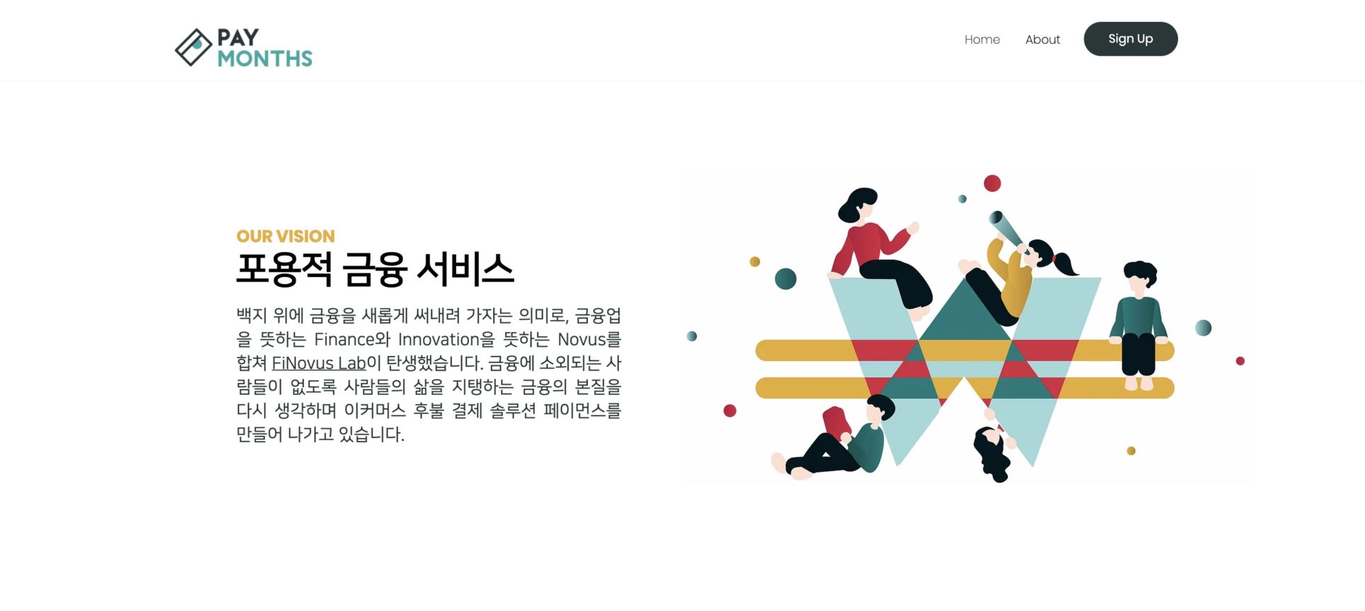

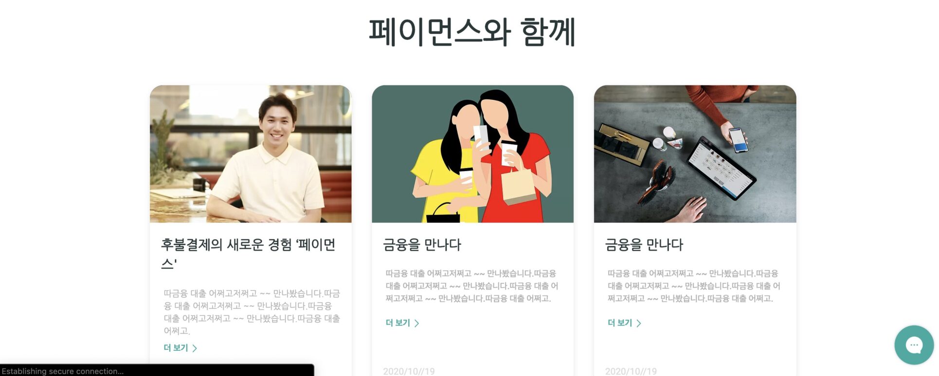
Above are screens from the About section. Showcasing the company's vision and mission.
MOBILE VERSION

HOME
Timed ineractions are utilized in text positioning, patterns, and buttons (same as website).
• Logo collapses to icon for clarity and space efficiency
• Motion interactions preserved but simplified
• Information hierarchy tightened for fast scanning
ABOUT PAYMONTHS
The About flow could be accessed via the hamburger menu.
Pattern art that was in the website version is removed from the mobile version to emphasize simplicity and prioritize text legibility on a smaller screen.
The interactions subtly appear as the user scrolls. They are utilized in the section header icons, text positioning, illustrations, and buttons.

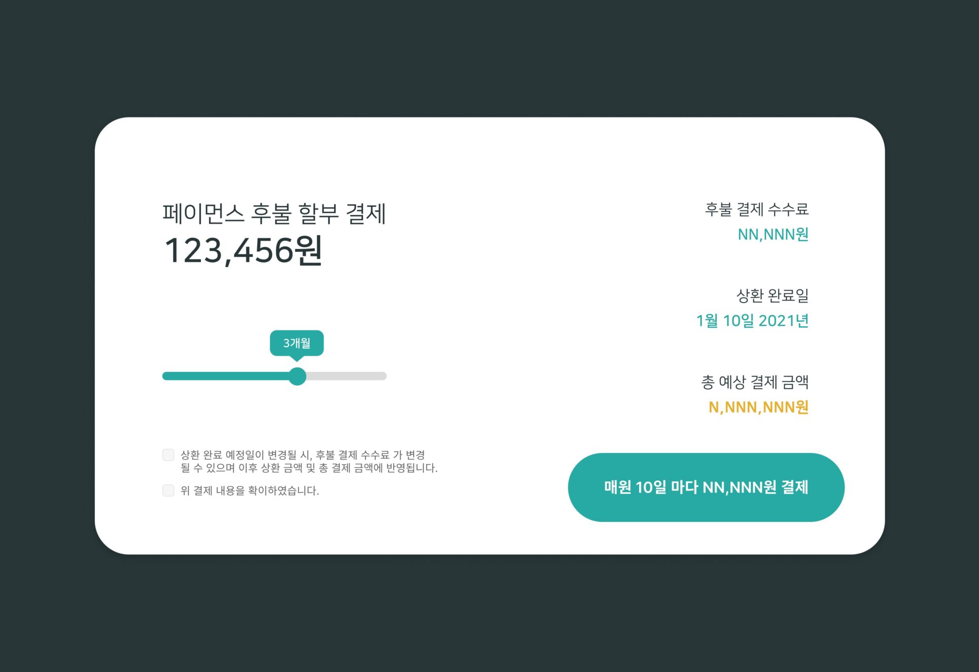
B2B Service UI Design
Financial tools for businesses are often dense and overwhelming. My goal was the opposite:
• Break complex financial actions into short, discrete steps
• Ensure no single screen requires more than ~30 seconds to understand
• Use hierarchy (color, spacing, typography) to guide decision-making
The biggest challenge was structuring information around money, deadlines, and risk without overwhelming the user. The UI emphasized progression, clarity, and confidence—so users always knew what to do next.


2020